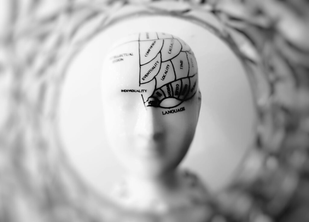
If you’re struggling to convert visitors into customers, leads, or signups, the problem might not be your design or your copy—it might be your understanding of human psychology.
Great landing pages don’t just look good. They tap into how people think, feel, and decide: their psychology. When you understand what drives human behavior, you can design landing pages that not only attract attention but compel action.
Let’s break down the key psychological principles that drive conversions—and how to use them effectively on your landing page.

1. Cognitive Ease: Make It Effortless
Humans are naturally drawn to simplicity. Our brains are wired to conserve energy and avoid cognitive overload. This is called cognitive ease—and your landing page must feel effortless to process.
How to apply it:
- Use short, punchy headlines
- Stick to one clear message
- Use bullet points instead of long paragraphs
- Use a clean, minimal layout with plenty of white space
Remember: If people have to think too much, they’ll bounce.
2. The Power of Social Proof
No one wants to be the first to try something new. That’s why we trust reviews, referrals, and popularity. This principle—social proof—is rooted in the idea that people follow the actions of others, especially when uncertain.
How to apply it:
- Add testimonials with names, faces, and results
- Include customer logos or case studies
- Mention number of users, downloads, or customers served
- Show star ratings or third-party reviews (e.g., Trustpilot, G2)
Example:
“Trusted by over 10,000 marketers.”
This simple line instantly builds trust.
3. FOMO (Fear of Missing Out)
Scarcity and urgency are powerful motivators. When people feel they might miss out on something valuable, they act quickly. This is the psychology effect of FOMO.
How to apply it:
- Use countdown timers on offers
- Mention limited spots, stock, or time
- Use phrases like “Only 3 left” or “Offer ends in 2 hours”
Warning: Don’t fake scarcity. If users catch on, it damages credibility.
4. The Paradox of Choice
We like having options, but too many choices can paralyze us. This is known as the paradox of choice. When visitors are faced with multiple CTAs, navigation options, or product types, they delay action—or leave.
How to apply it:
- Focus your page on one goal
- Have one primary CTA
- Eliminate distractions like menu bars or footer links
Example:
Instead of “Sign Up,” “Contact Us,” and “Download eBook” on the same page—just stick to one.
5. The Principle of Reciprocity
People are more likely to give when they’ve received something of value. This is the psychological principle of reciprocity—and it’s why lead magnets work so well.
How to apply it:
- Offer a free downloadable guide, checklist, or tool
- Give away value before asking for something in return
- Use phrases like “Get your free bonus” or “Start learning today—no signup required”
Example:
“Download our free 10-page playbook before you decide.”
It feels generous—and generosity builds trust.
6. Anchoring and Framing
Anchoring is when people rely heavily on the first piece of information they see. Framing is how the same info can be presented to influence perception.
How to apply it:
- Show the original price before the discounted one
- Present your most expensive package first (makes the cheaper one feel like a bargain)
- Frame your offer in terms of savings, outcomes, or time gained
Example:
“Normally $199. Today only: $49.”
or
“Save 10 hours a week with our automation tool.”
These “frames” give context that influences decision-making.
7. Visual Hierarchy and Directional Cues
Humans scan web pages following predictable patterns (like the F-shaped or Z-shaped reading flow). You can guide where users look and what they focus on.
How to apply it:
- Use larger fonts for headlines
- Use bold colors for your CTA button
- Place key elements (like CTAs) “above the fold”
- Use directional cues like arrows or images of people looking at the CTA
Pro tip: Use faces, eyes, or finger-pointing icons to subtly direct attention.
8. Loss Aversion
People fear losing more than they desire gaining. This psychological tendency—loss aversion—means people are more likely to act to avoid a loss than to gain a reward.
How to apply it:
- Frame offers in terms of what users might lose by not acting
- “Don’t miss out,” “Last chance,” or “Your spot expires in 12 hours”
Example:
“Still thinking? Your 50% off code expires at midnight.”
9. Consistency and Commitment
Once people commit to something small, they’re more likely to commit to something bigger. This is known as commitment bias.
How to apply it:
- Use a micro-conversion (e.g., “Get a free sample”) before a macro-conversion (e.g., purchase)
- Offer a quiz or assessment that ends with a tailored offer
- Allow users to start with no risk (“Start Free,” “No Credit Card Required”)
Example:
“Take the 1-minute quiz to find your ideal skincare plan.”
Now they’re emotionally invested—more likely to continue.
Conclusion: Psychology Is the Ultimate Conversion Tool
A successful landing page doesn’t trick users—it understands them. It uses design and copy aligned with how people feel, react, and decide.
Here’s a quick recap of the psychology principles that convert:
- ✅ Cognitive ease
- ✅ Social proof
- ✅ FOMO
- ✅ Paradox of choice
- ✅ Reciprocity
- ✅ Anchoring & framing
- ✅ Visual hierarchy
- ✅ Loss aversion
- ✅ Commitment bias
You don’t need to use all nine at once. Start with a few that align naturally with your brand and audience, and test what works. The results might surprise you.
